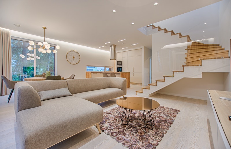
Because your living room is one of the first rooms people see when they walk into your house, there’s a lot of pressure to make it appear splendid. It is also one of the most often used rooms in the house, and it serves a variety of functions. It’s a room for entertaining, a calm spot to read a book, and a comfortable place to watch TV or do homework at different times.
It’s no surprise that many people struggle to acquire the proper look and feel for their living room furniture arrangement. Unfortunately, these typical living room design mistakes could be the cause of such issues.
Using Too Many Large Pieces of Furniture
People frequently believe that they require a furniture suite with a sofa, loveseat, matching chairs, and a coffee table. However, in a typical living room, this might be overwhelming and appear claustrophobic.
Instead, it’s advised that you limit yourself to only one or two major pieces, which would visually open up the room. A few larger-scale items can enhance even modest areas. Just make sure you’re not stuffing the room with bulky items you don’t use or don’t need.
Not Having Enough Seating
The quantity and variety of items and their arrangement and scale can be just as essential for furniture. For example, not having enough seating in your living room is a common blunder that leads to a layout that isn’t effective for family and friends.
Use various seating pieces strategically, such as a classic 2-seater sofa paired with ottomans or occasional chairs. This gives the design a layered, deliberate aspect and ensures that everyone has a seat. There’s no need to cram one of each of these items into your bag. To create a welcome living environment, all you have to do is choose a few types that will work best for your setting.
Having a Room with No Balance
You should give decorative elements in a living room the same thought and consideration as the furniture components. Accessories are a vital finishing touch for a little black dress and can work as jewelry. They add personality to a space and make it appear polished and finished.
Stacks of coffee table books are required to add splashes of color and collected air to a room. You can also use plants or flowers to bring vitality to an area instantly. You don’t have to become a maximalist if that’s not your style, but adding a layer of your personality to a place is always a good idea. Begin with items you’ve gathered over the years, such as a vibrant vase or a fun bust sculpture. Then sprinkle in a few things you like merely for their appearances, such as a colorful vase or a delightful bust sculpture.
Buying Furniture That Isn’t Built to Last
Fast fashion for the living room is one thing when it comes to accessories and textiles. Larger purchases, on the other hand, should be avoided if at all possible. Unfortunately, several designers claim that they frequently see homeowners purchasing large pieces of living room furniture without considering how long they would last. They understand the desire to decorate the living room and feel comfortable swiftly, but this can result in costly blunders.
It’s a good idea to order samples of fabrics and finishes before buying living room furniture to see how they hold up while you’re actually “living” with them. Then, take the time to select pieces that you will cherish for years, if not generations, to come.
Using Too Small of an Area Rug
While area rugs are a terrific way to ground a living room, they can make a space feel disproportionate if they’re too small. A large area rug should be able to fit beneath your furniture. It’s recommended a larger rug for formal living rooms so that there is an equivalent distance surrounding your furniture.
You can bend these rules a little for more casual family settings. Rugs should begin around halfway under your furniture in these circumstances, with a little space around those legs as a visual buffer. This adds scale to the area and makes it feel more developed, balanced, and inviting.
Mounting Curtains Too Low
Suppose you think your living room curtains should start where your window does. In that case, you might be missing out on a visual trick that many designers claim will make your space appear more prominent and more admirable.
Hanging your curtains three to eight inches higher than your windows will attract the eye upward. This will make your room appear more spacious, and your ceilings appear higher. The only exception is that your curtains must be long enough to accommodate this. Curtains that are appropriately sized will always kiss the floor neatly without pooling. Anything shorter will serve to highlight the fabric’s lack of length.


